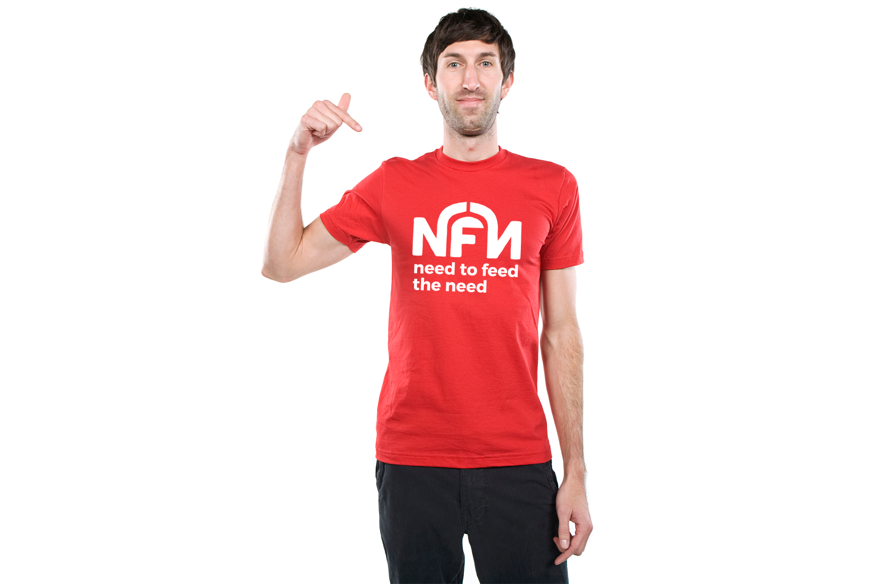
Need To Feed The Need - Logo Redesign
Need to Feed the Need (NFN) is a non profit NGO that is known for distribution of food and other basic necessities in Kuala Lumpur.
They recently reached a 4 year milestone and wanted to rebrand, looking for a redesign of the organisation's logo. They were looking for a fresh clean look with the logo. I was given the creative freedom to move away from the use of human forms or body parts as they felt it was cliche of NGO logos.
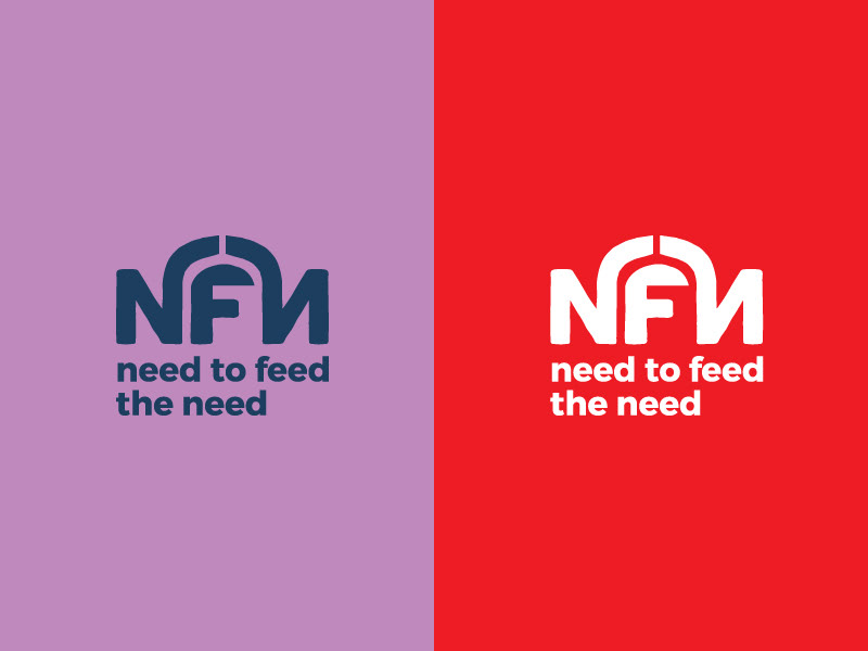
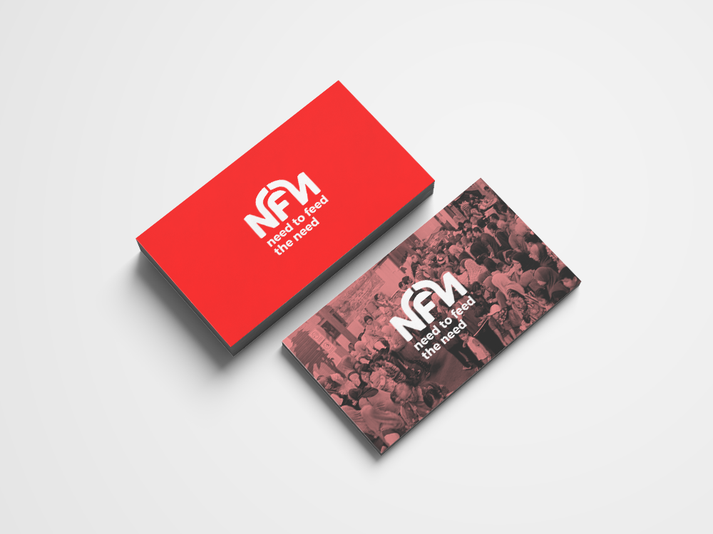
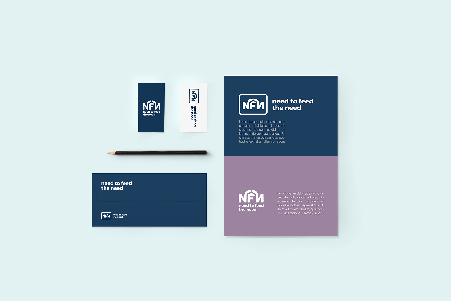
The design that I came up with was the use of typography to give a clean look. The enjoining of the 2 letters "N" symbolises an umbrella of hope that provides shade, care and love for the needy. This is relatable to the organisations current position as they grow from not only being a soup kitchen but also diversifying their services into providing a sustainable ecosystem for the homeless and urban poor in Kuala Lumpur.
The design that I came up with was the use of typography to give a clean look. The enjoining of the 2 letters "N" symbolises an umbrella of hope that provides shade, care and love for the needy. This is relatable to the organisations current position as they grow from not only being a soup kitchen but also diversifying their services into providing a sustainable ecosystem for the homeless and urban poor in Kuala Lumpur.
NFN operates out of Medan Kasih, a purpose built government-constructed facility at Lorong Medan Tuanku 2, every Thursday night. If you are interested to know more about the organisation and and keen to help please checkout their facebook page: https://www.facebook.com/needtofeedtheneed/