OCB: On Come Back - Logo Design & Merchandise
Project Scope
I was commissioned to develop a complete visual identity system for OCB - On Come Back, a lifestyle brand focused on "resetting" and rediscovering passion through activities like golf, surf-skating, outdoor camping, and driving enthusiasts.
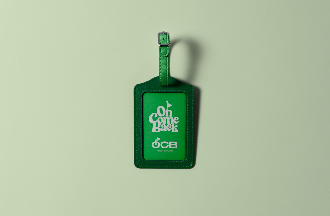
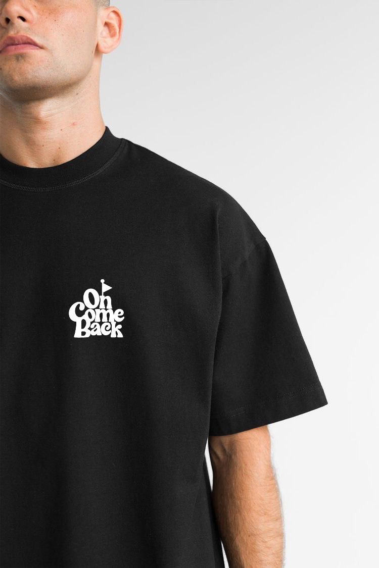
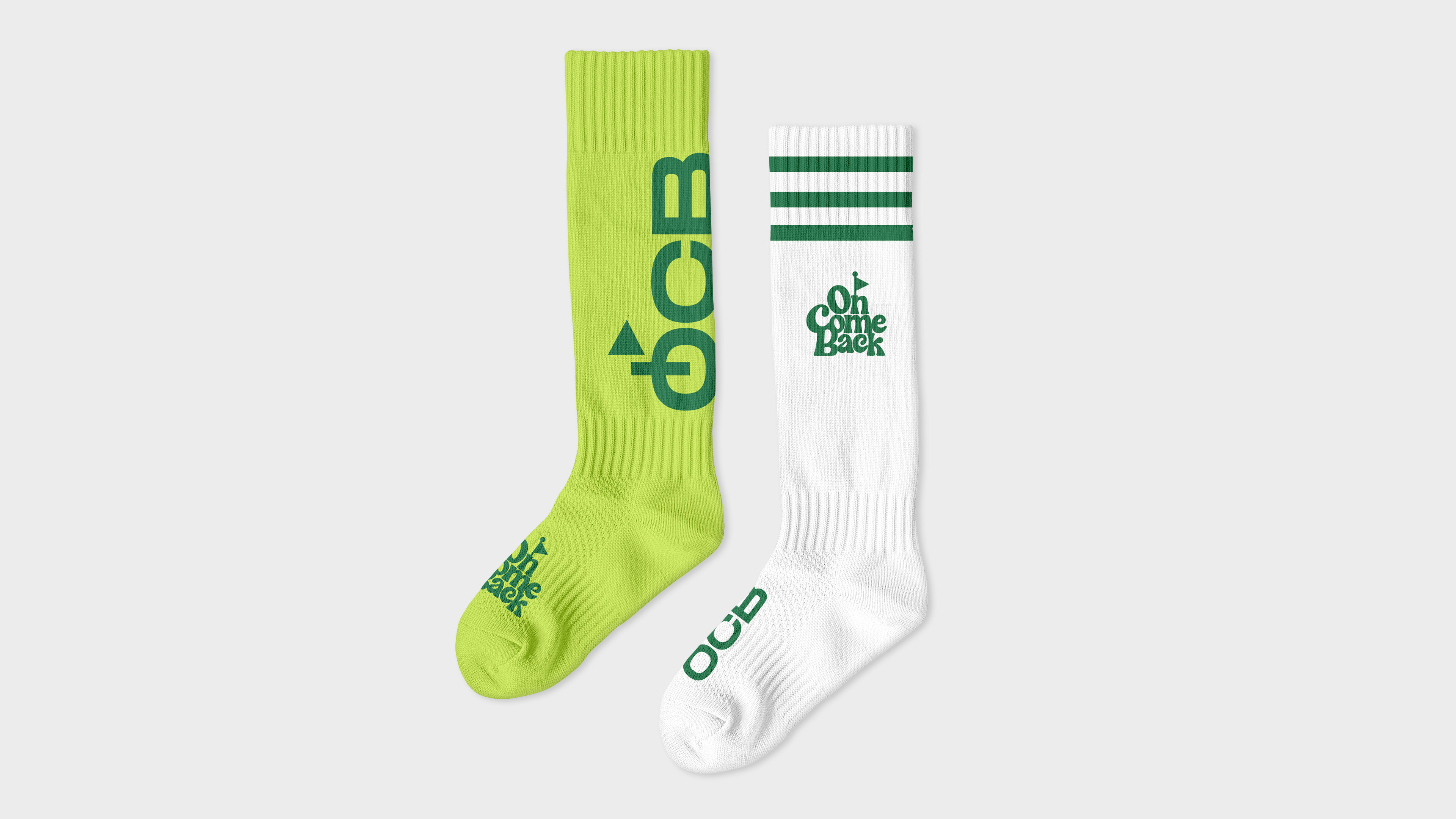
The project started with the scope of designing a distinctive logo that embodies the brand's philosophy of continuous reinvention and a "back to basics" approach and a consistent visual identity to ensure consistent visual representation across OCB merchandise.
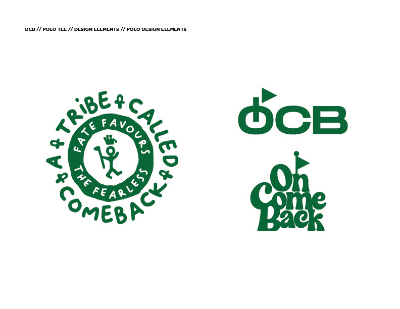
Logo Design Approach
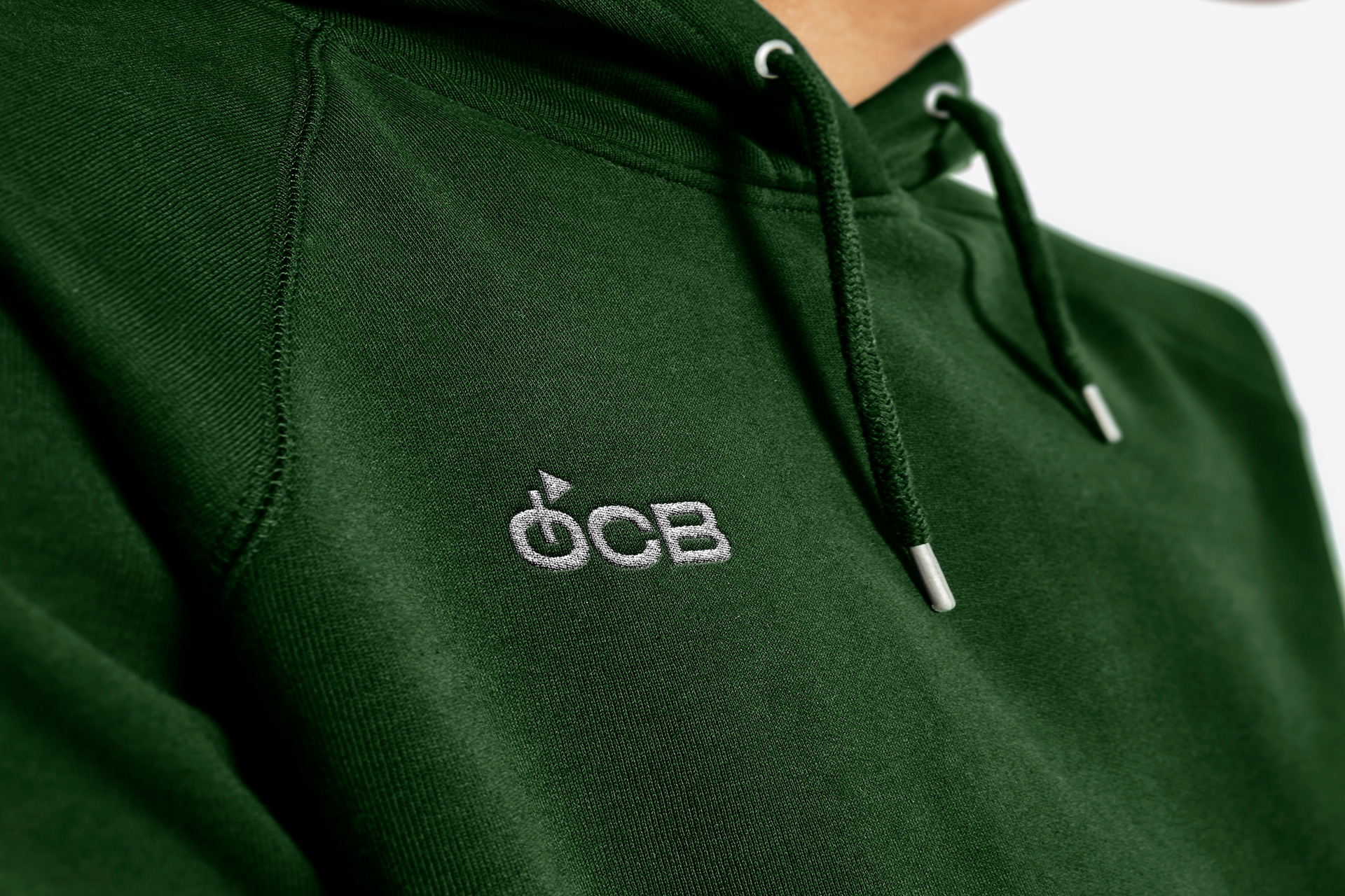
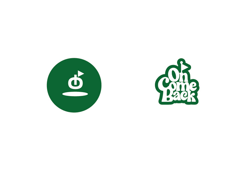
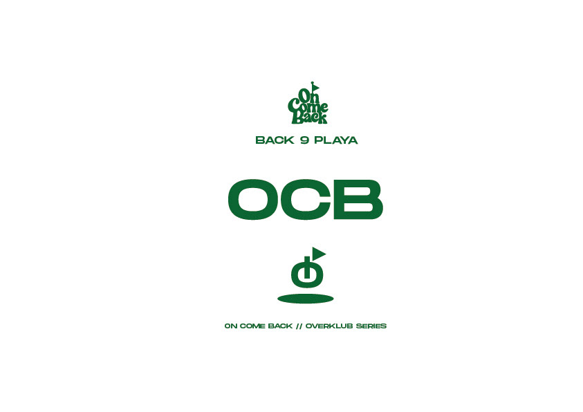
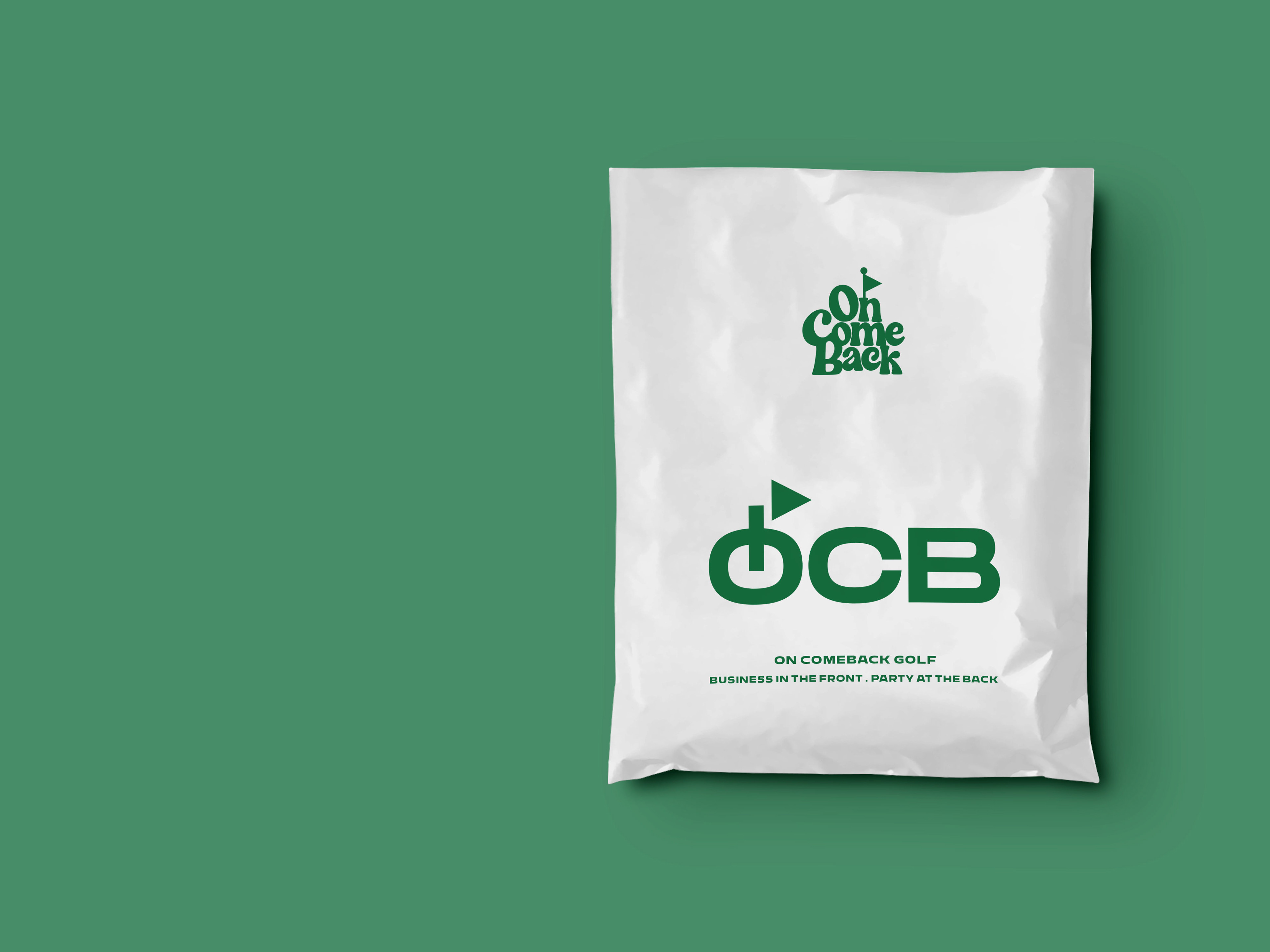
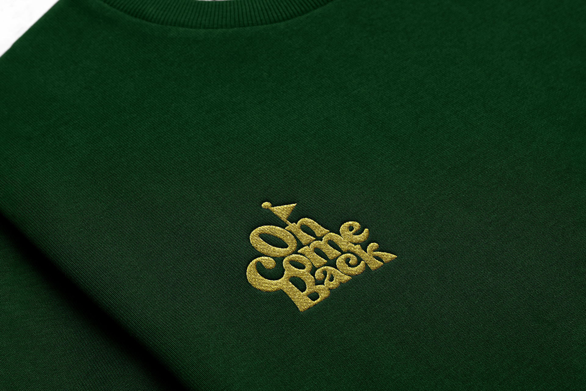
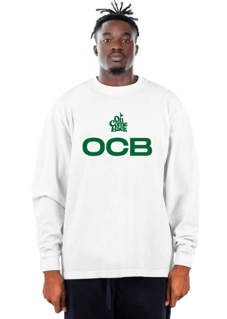
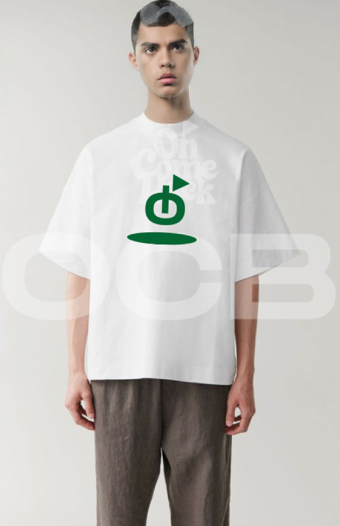
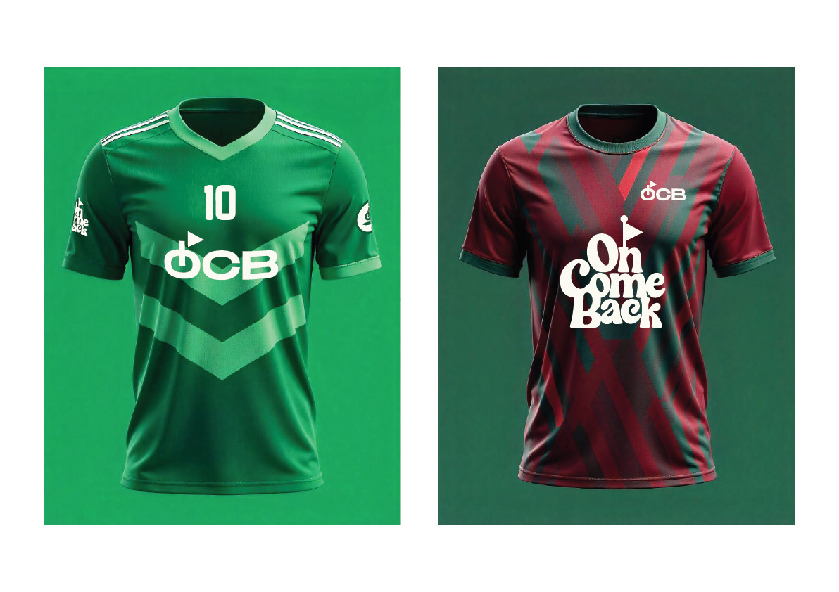
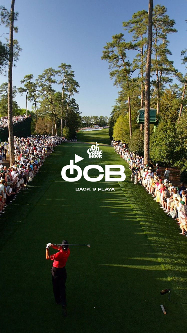
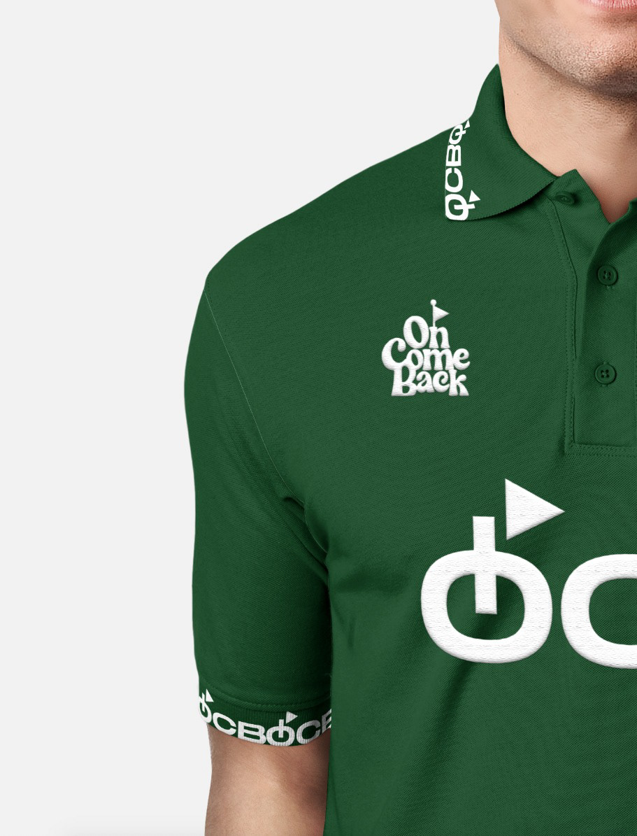
The primary logo features a bold, sans-serif typography for "OCB" (On Come Back). The "O" is designed as a stylised "On" button, visually representing the act of "resetting" and initiating a new beginning. This clean and impactful logo effectively communicates OCB's core philosophy.
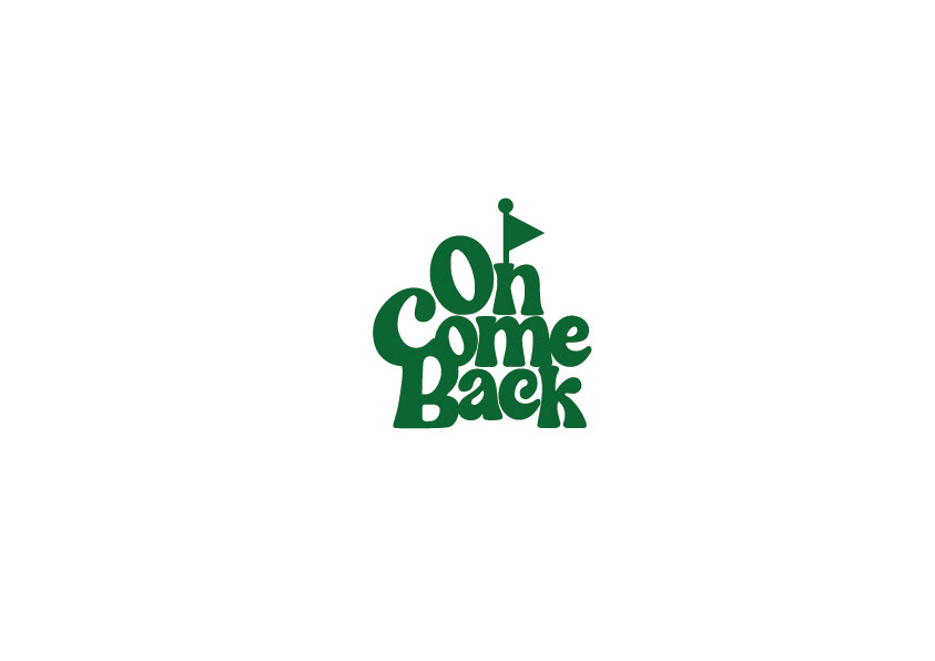
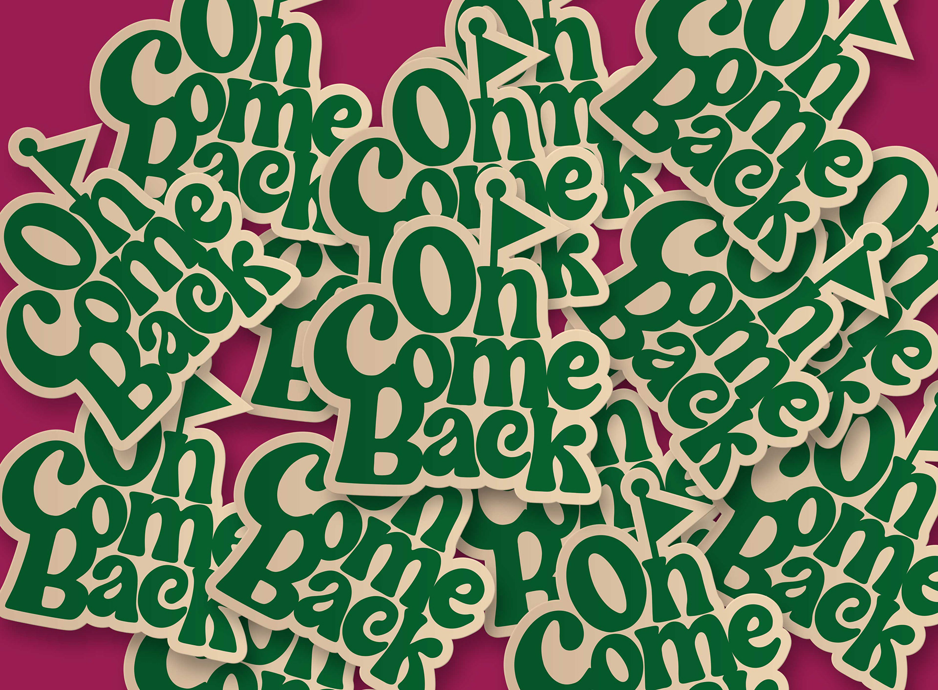
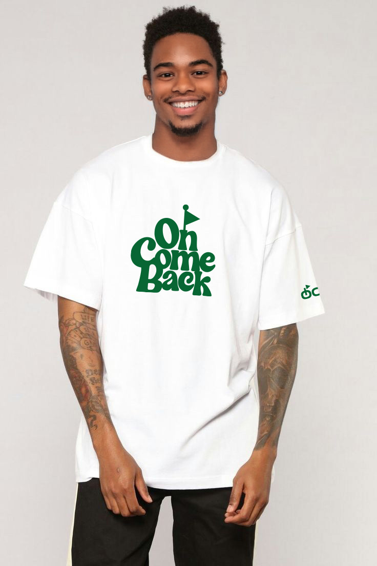
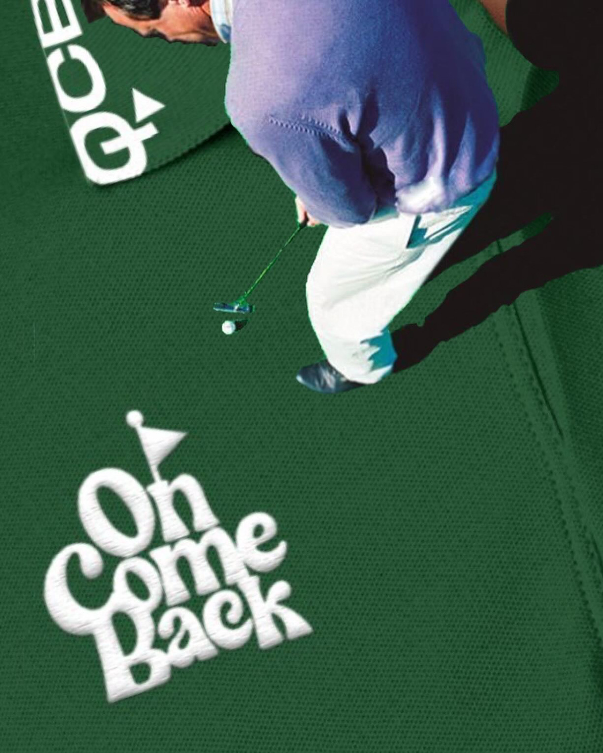
A playful and distinctive logo mark accompanies the primary logo. It depicts a stylised hill with a golf flag at its peak, subtly forming the words "One Come Back" within its contours, signifying the win. This logo mark adds a touch of whimsy and reflects OCB's focus on outdoor activities like golf.


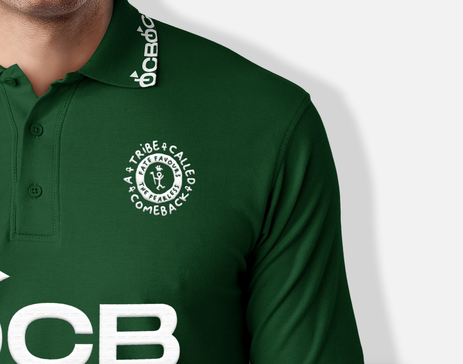


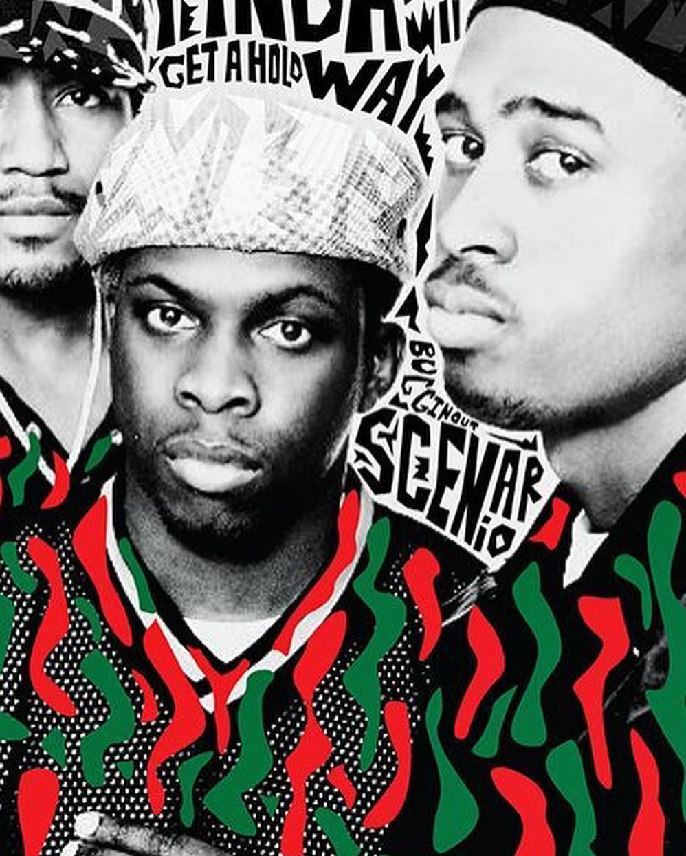
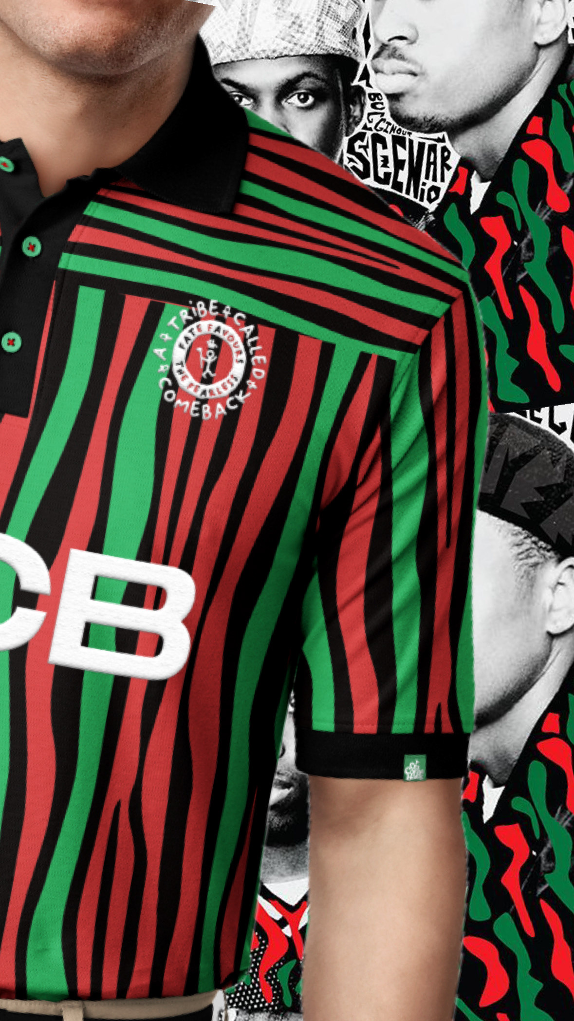
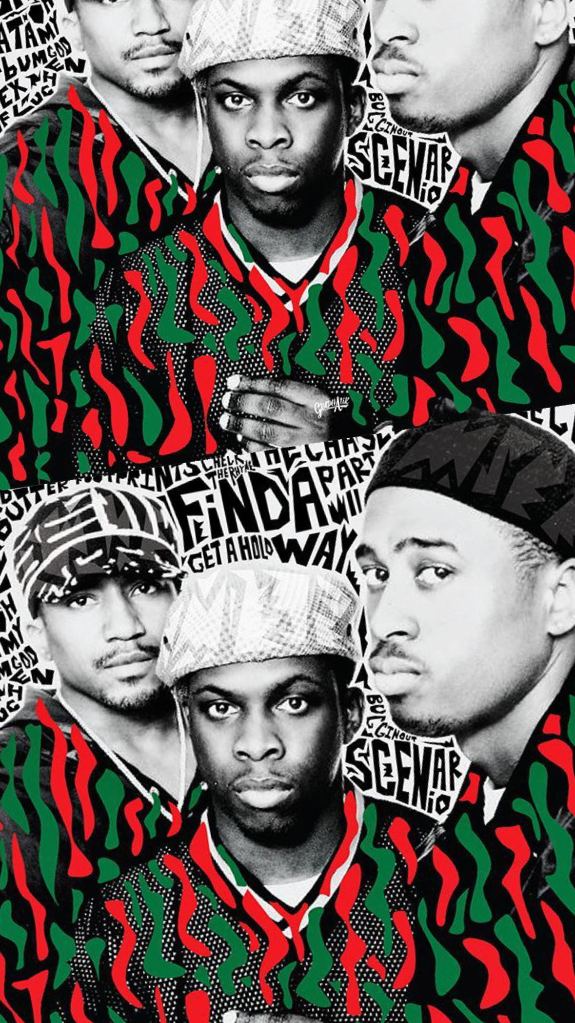
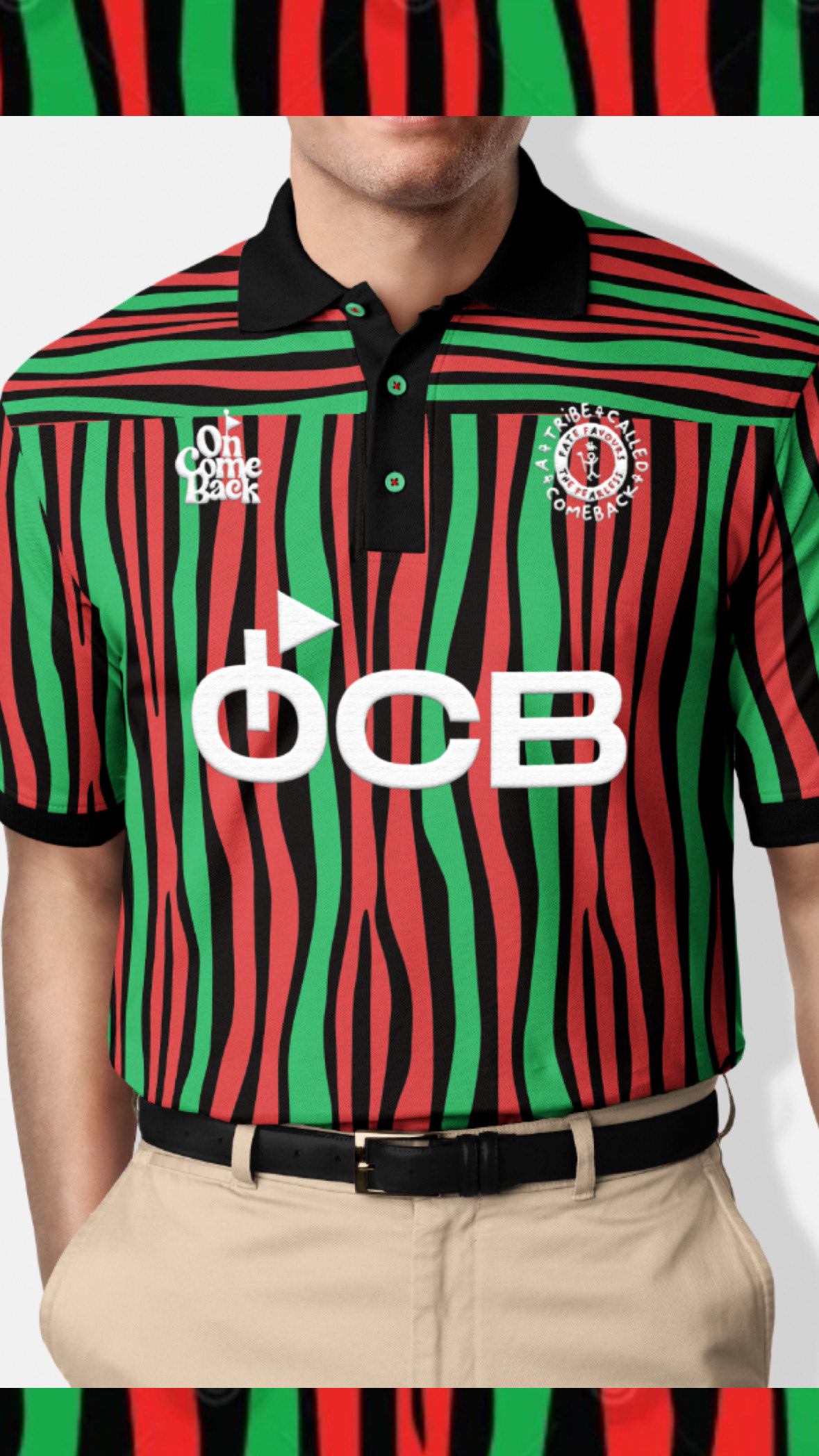
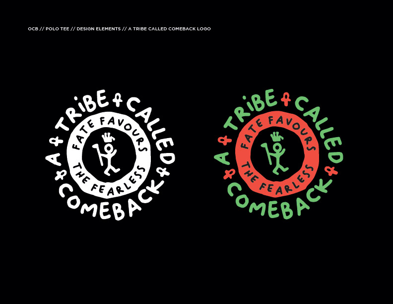
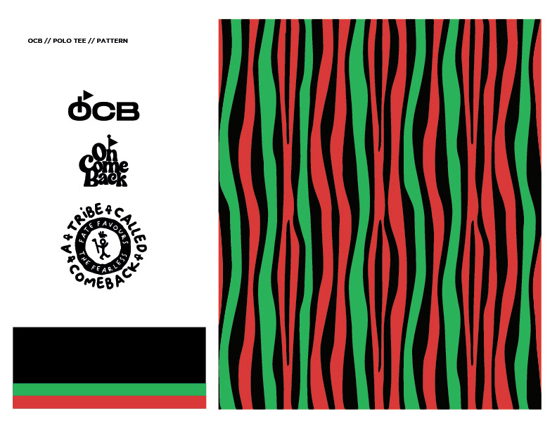
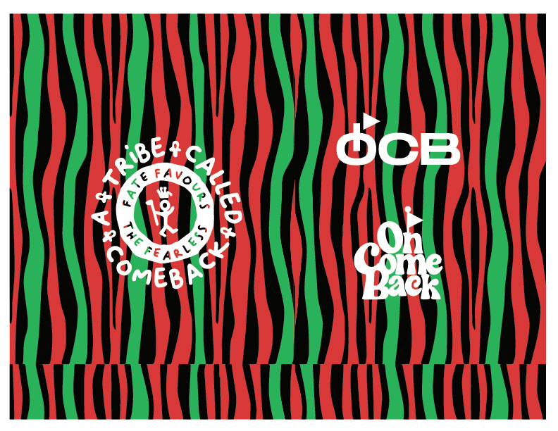
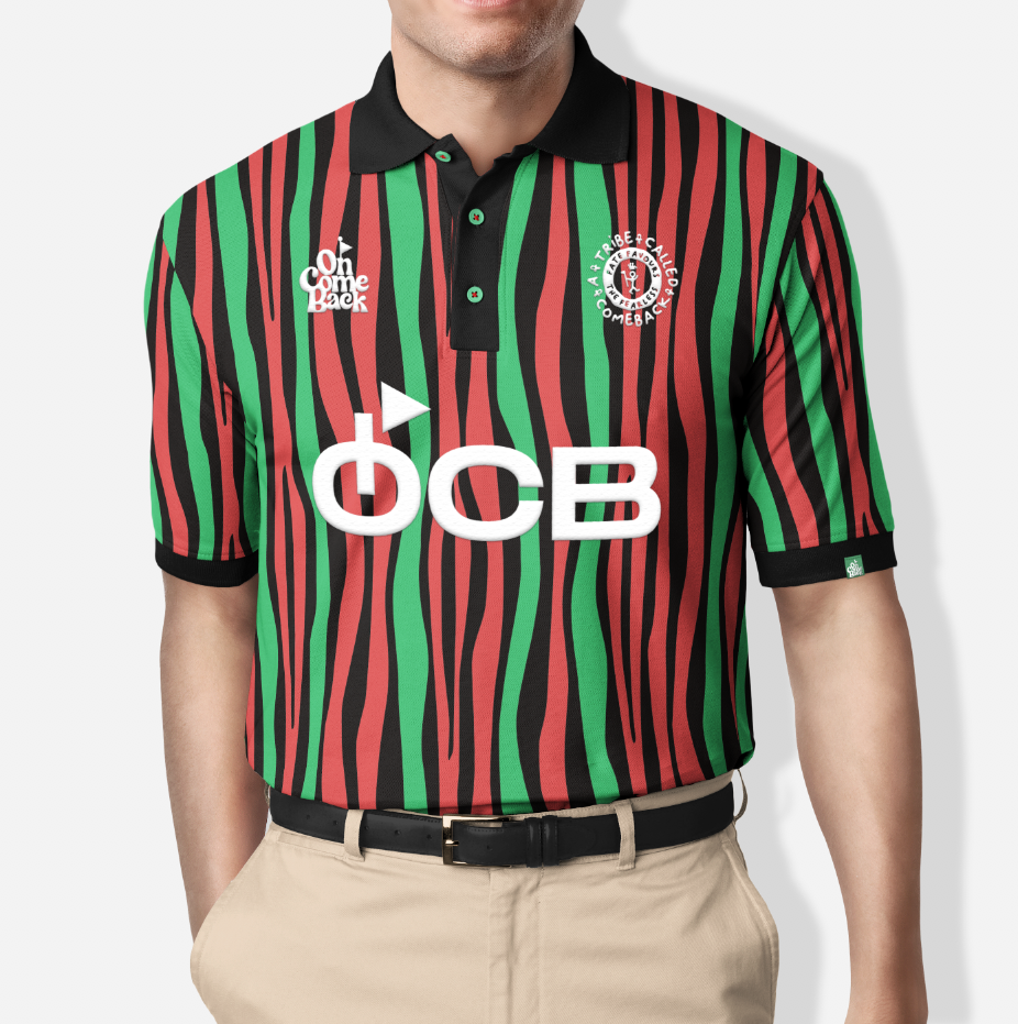
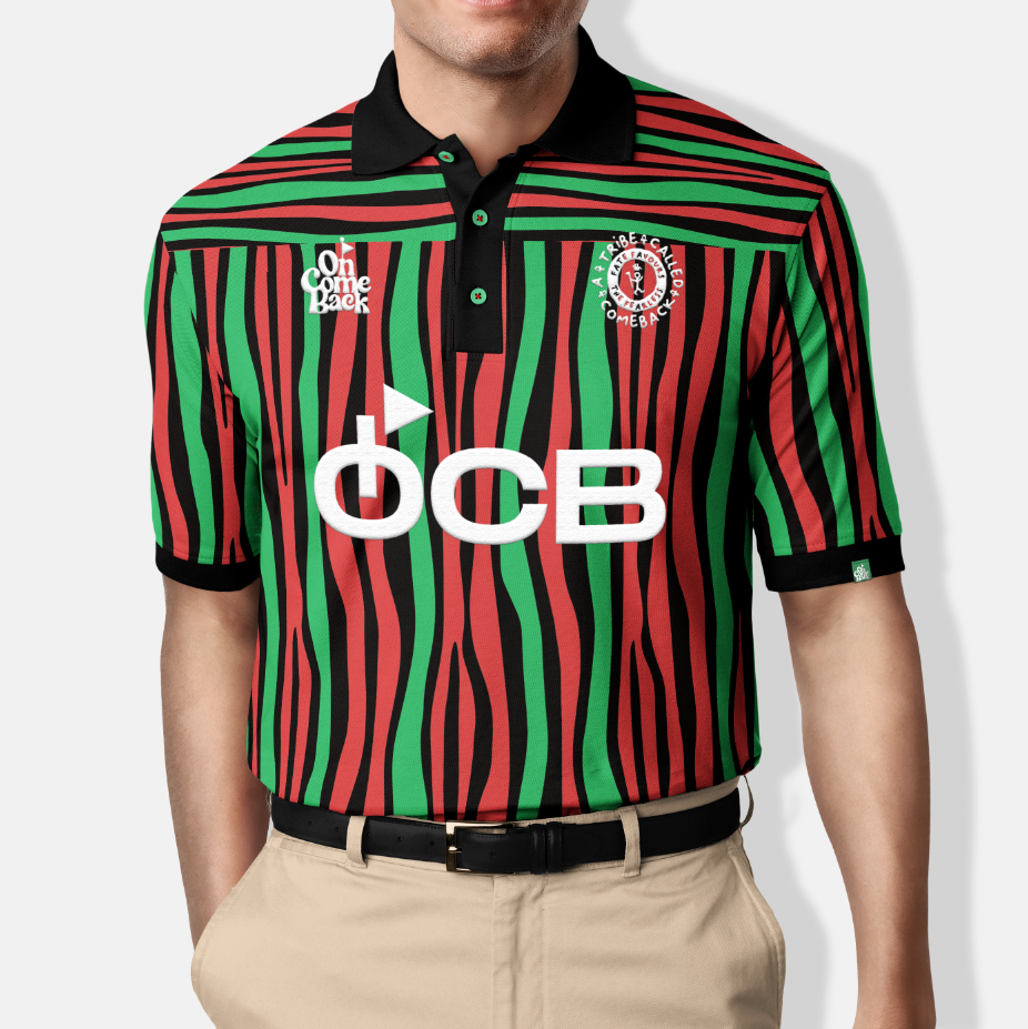
OCB: ACTQ Tribute Polo Tee Design
The inaugural OCB polo shirt capsule, pays homage to the iconic hip-hop group A Tribe Called Quest (ATCQ).
Drawing inspiration from the group's signature style, the collection incorporates their iconic "Q-Tip" logo, Afrocentric colours and patterns derived from the Kente Cloth of Congo which prominently featured in ACTQ's album covers throughout the years. The vibrant colour palette and patterns infuse the collection with a striking visual aesthetic, creating a culturally resonant and unique expression of both musical and fashion heritage into the golfwear space.